Attain App Healthy Actions Feature
In the Attain App, Healthy Actions are easy to digest tips and actions deployed via content cards daily. Healthy Actions are an opportunity to develop daily engagement with users while improving healthy habits around topics of sleep, nutrition, mindfulness and activity. There is also an opportunity for personalization through more clinical content deployed based on user's medical history and claims.
The goal of optimizing the design of the Healthy Action Cards was to increase engagement rates with the cards through improved readability and hierarchy of card content.
87.9 % of users complete daily everyday lifestyle Healthy Actions while 85.7% of users complete key moment clinical Healthy Actions
The team conducted usability baseline testing, design exploration and workshopping to identify the first phase of improvements planned to launch, collect real time user feedback learnings, then continue to adapt and improve.
Proposed designs include:
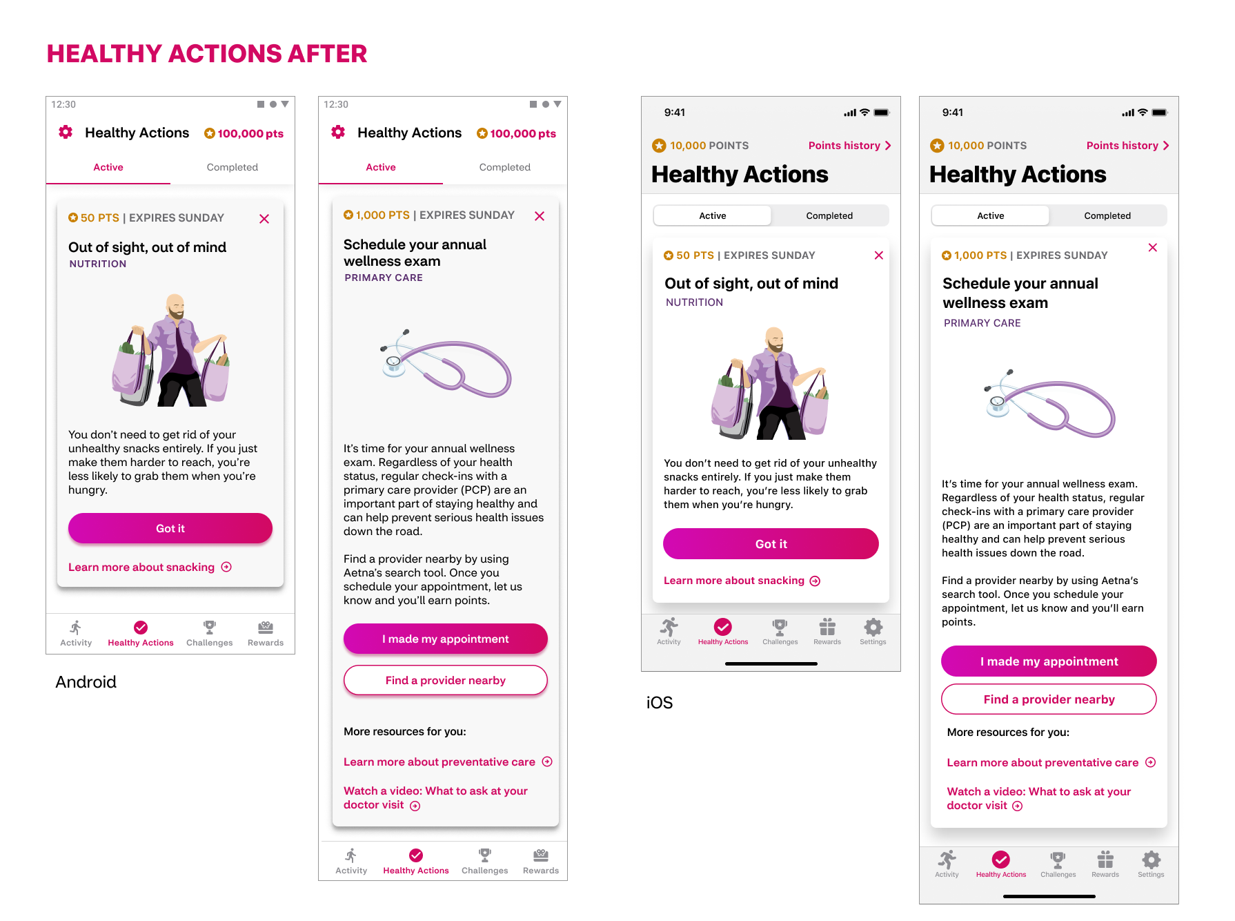
• Improved CTA hierarchy: Updated call to action hierarchy to include clearly denoted primary and secondary buttons for adjudicated actions as well as links for related resources. This change was in reaction to user feedback on the need for clarity around which interactions would give credit for a card and which interactions provided additional resources for the user related to the card content.
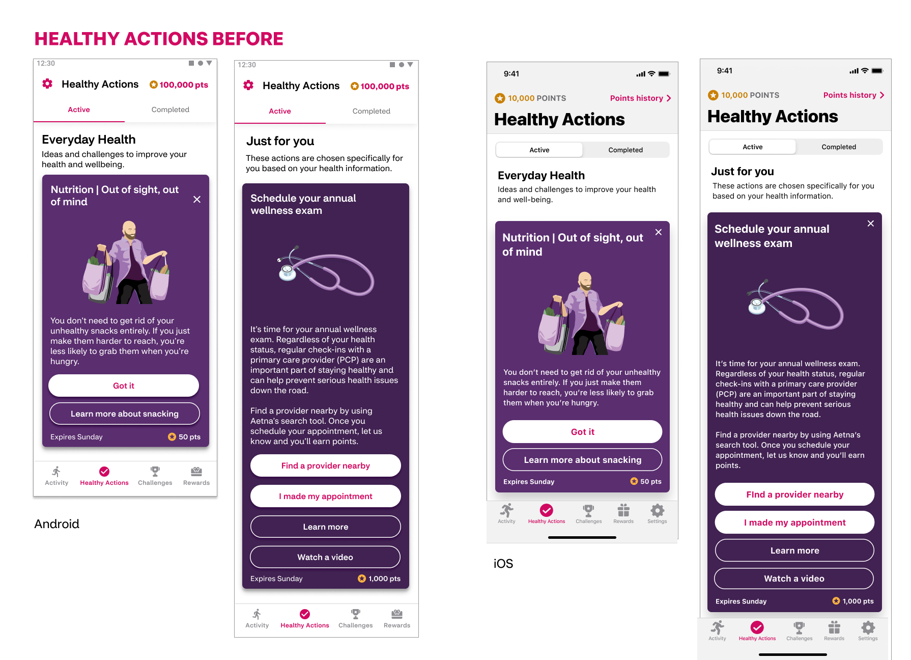
• Update in the color of the cards for improved readability: White background with black text is easier for most users than white text on violet color, especially for longer clinical cards.
• Retain branding personality: Retained brand colors and personality with the use of violet toned illustrations
• Added theme visibility: With the addition of a label that denotes the theme of the Healthy Action cards, users will have more awareness of content themes that span over a week of time or clinical cards that span over several weeks.
• Increased visibility of points and date: Based on user feedback of importance, design moved the points value and expiration date from the bottom to top of the card.
• Removed ineffective copy: From user feedback, we learned there was a lack of attention paid to and clarity to the headlines that delineated the "everyday health" and "just for you" sections of Healthy Actions. This cleans up the space so users can focus on the information of higher importance rather than what had become white noise.
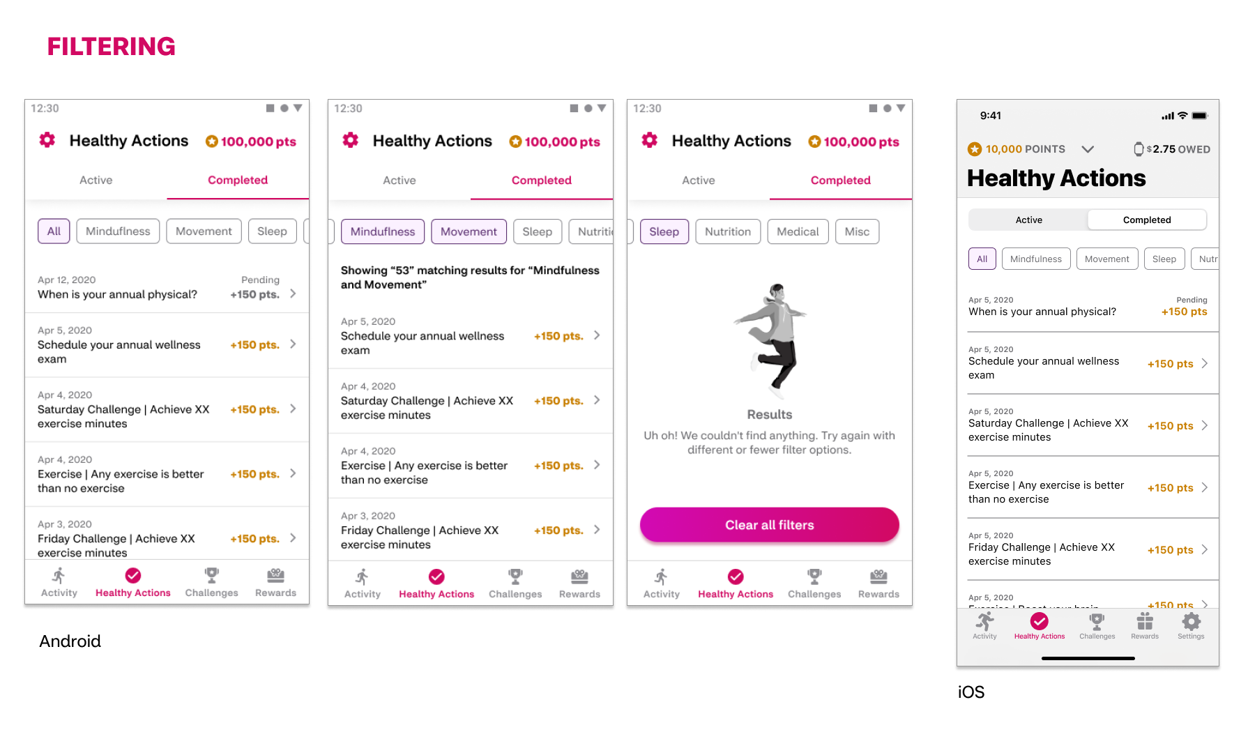
In usability studies, users expressed a desire to more easily look back on past content. A system of filtering was added to the Completed content section of the Healthy Actions tab in order to allow users to view by content topic and review tips and actions again.
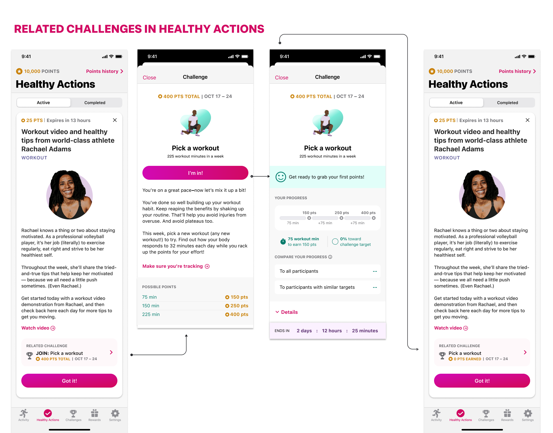
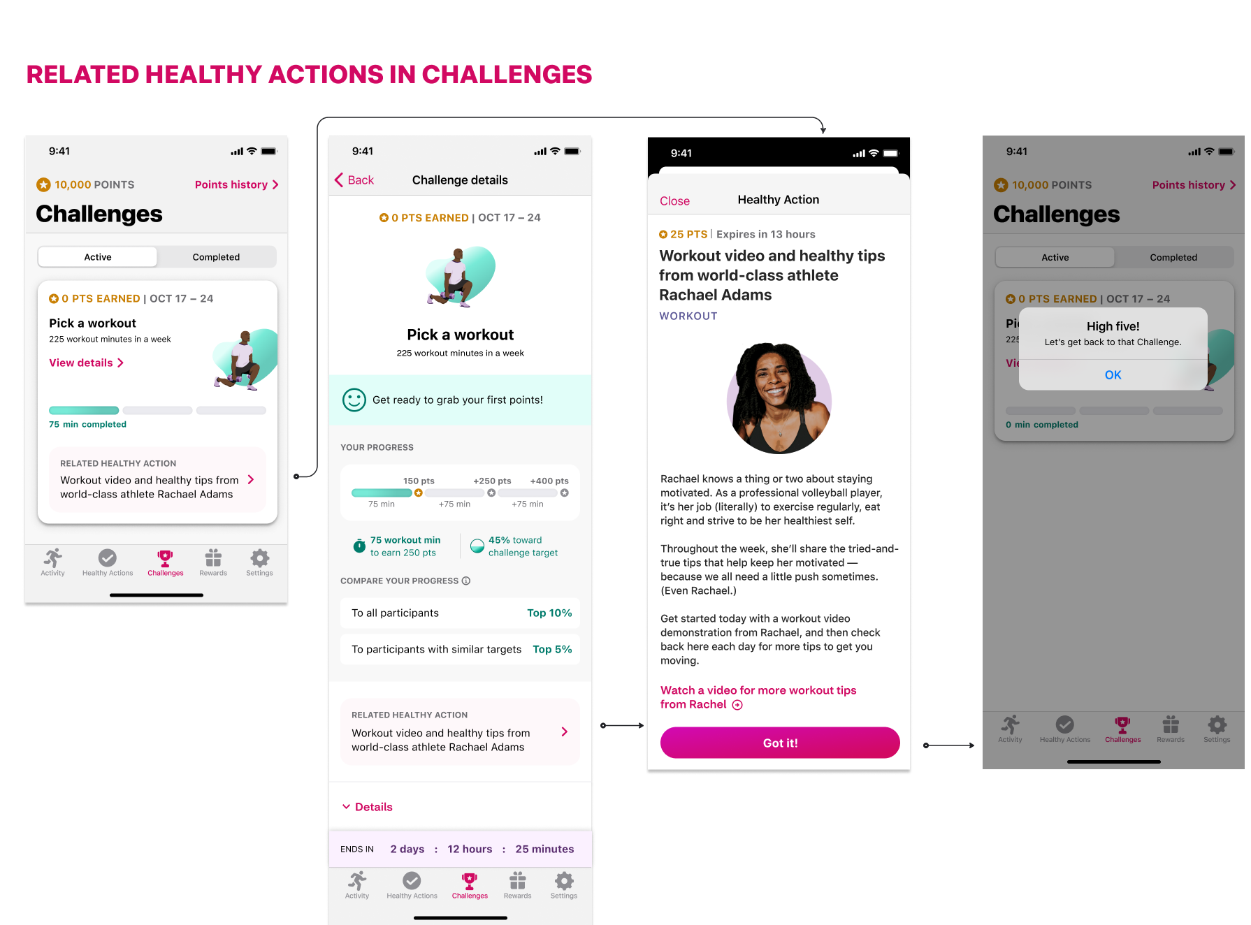
With the addition of the Challenge Feature in the app, there was a business desire to experiment with how users engage with content in multiple areas of the app. Vetted with usability testing, design created a visual indicator within Challenge and Healthy Action cards indicating there is related information in the corresponding tab. Users can view and interact with related content without leaving the current tab.
Unfortunately, the Attain app was sunset before these designs were implemented in production.