Attain App Accessibility Features
Throughout the Attain app, we strove to create the optimal experience for all users. This lead to an emphasis on accessibility and inclusion integration across app features with focus placed on UX/UI elements to support user's device accessibility settings.
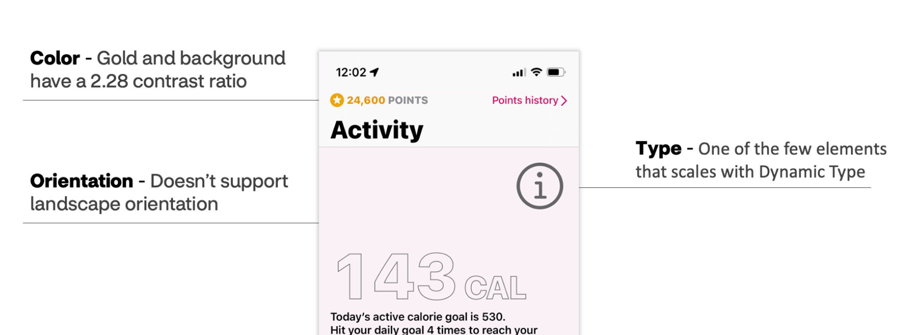
When Attain was first released, it was not built with accessibility in mind. During the rebuild of iOS version we implemented several accessibility feature updates throughout the app to remedy defects including color, type and orientation. With the build out of Android, and features that followed, an emphasis was placed on accessibility and inclusion in designs.
To determine best practices for accessibility, the designers worked with subject matter experts accessibility (a11y) design and engineering team mates, reviewed native system documentation and evaluated third party apps.
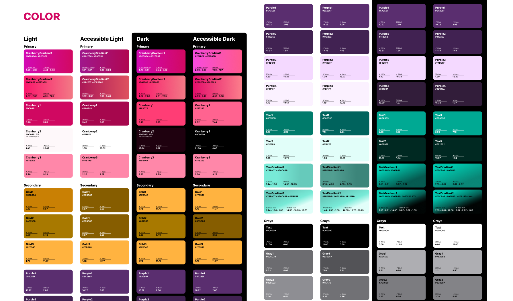
Colors used throughout were evaluated for color contrast levels based on their use in app. Several colors were adjusted from the original hues, especially the gold shades. The team also evaluated colors for implementation of dark mode and additional accessibility color modes which allow for higher contrast for users.
Varying color modes helps users choose what is best for them. Perhaps they like the aesthetic of dark mode, or they rely on the darker palette for contrast. A11y is about giving the tools for users to make their experience the best it can be no matter their situation.
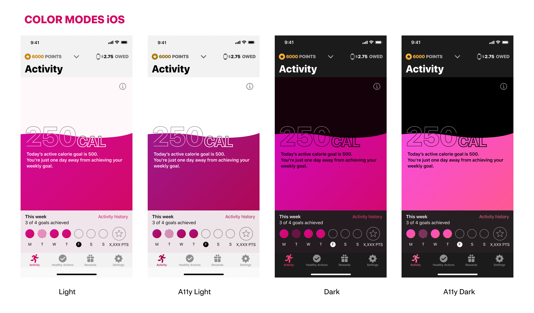
Color modes applied in app for iOS following Human Interface Guidelines, with contrast greater than the minimum in some cases. Most users know of the standard Light and Dark modes, but in the accessibility settings users can also toggle an increased contrast mode that works with both themes.
Gold is a challenging color used throughout the app to signify points, we have three different variations in the respective modes. The cranberry gradient is also a noticeable differences across the four themes as we aim to keep the look and feel of the original light mode while respecting the user’s color choice.
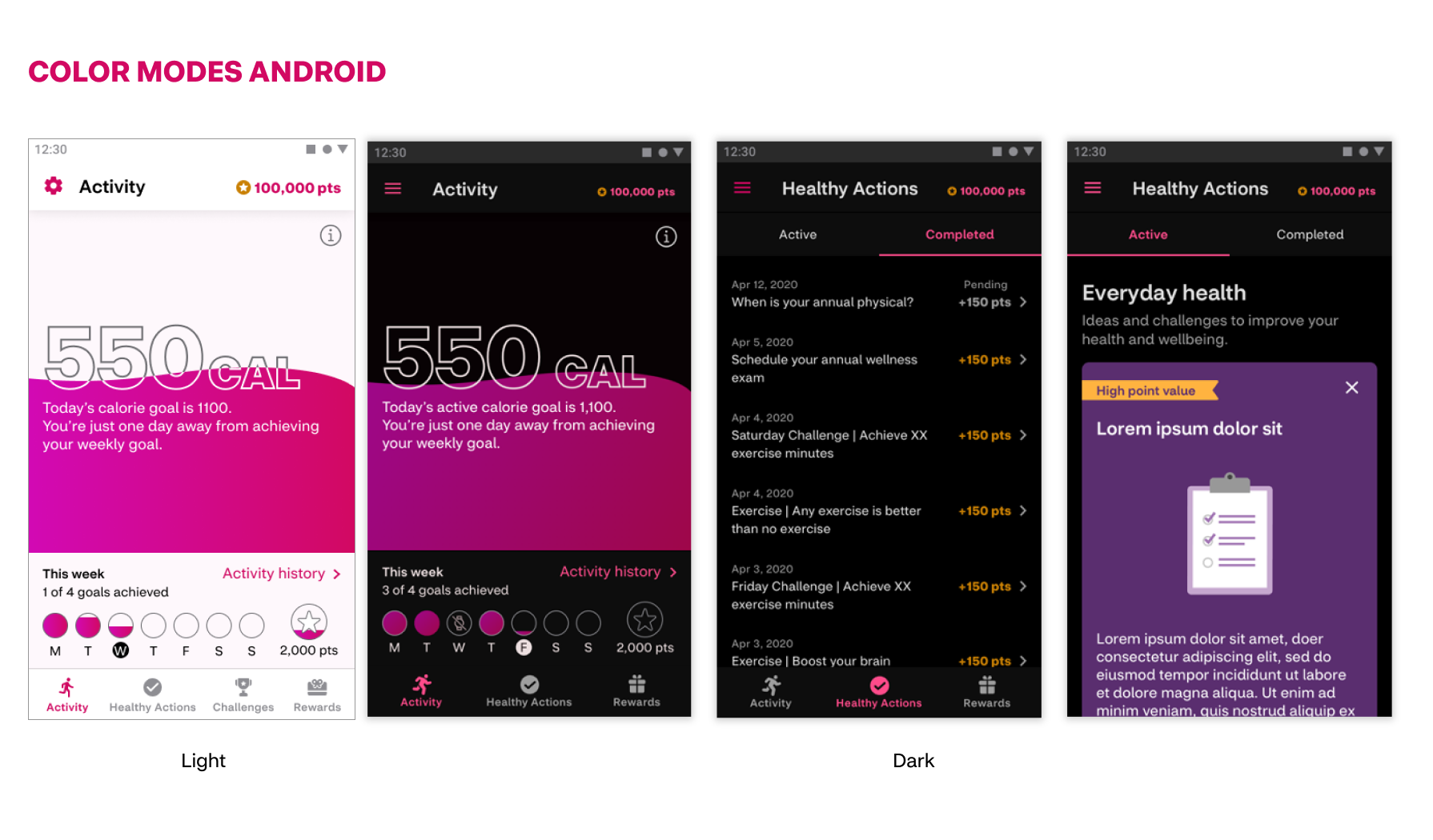
For color modes across Android Google provides extensive documentation on colors for light and dark mode in Material Design. We ultimately went with a modified version of Material 3 for Attain, with some more colorful elements like a slightly tinted background color, but still followed greatly muted colors from Material Design guidance on dark mode.
While often overlooked, not all users prefer a portrait orientation. Perhaps the user likes more reading space for large text or possibly the device is mounted and unable to move from landscape view.
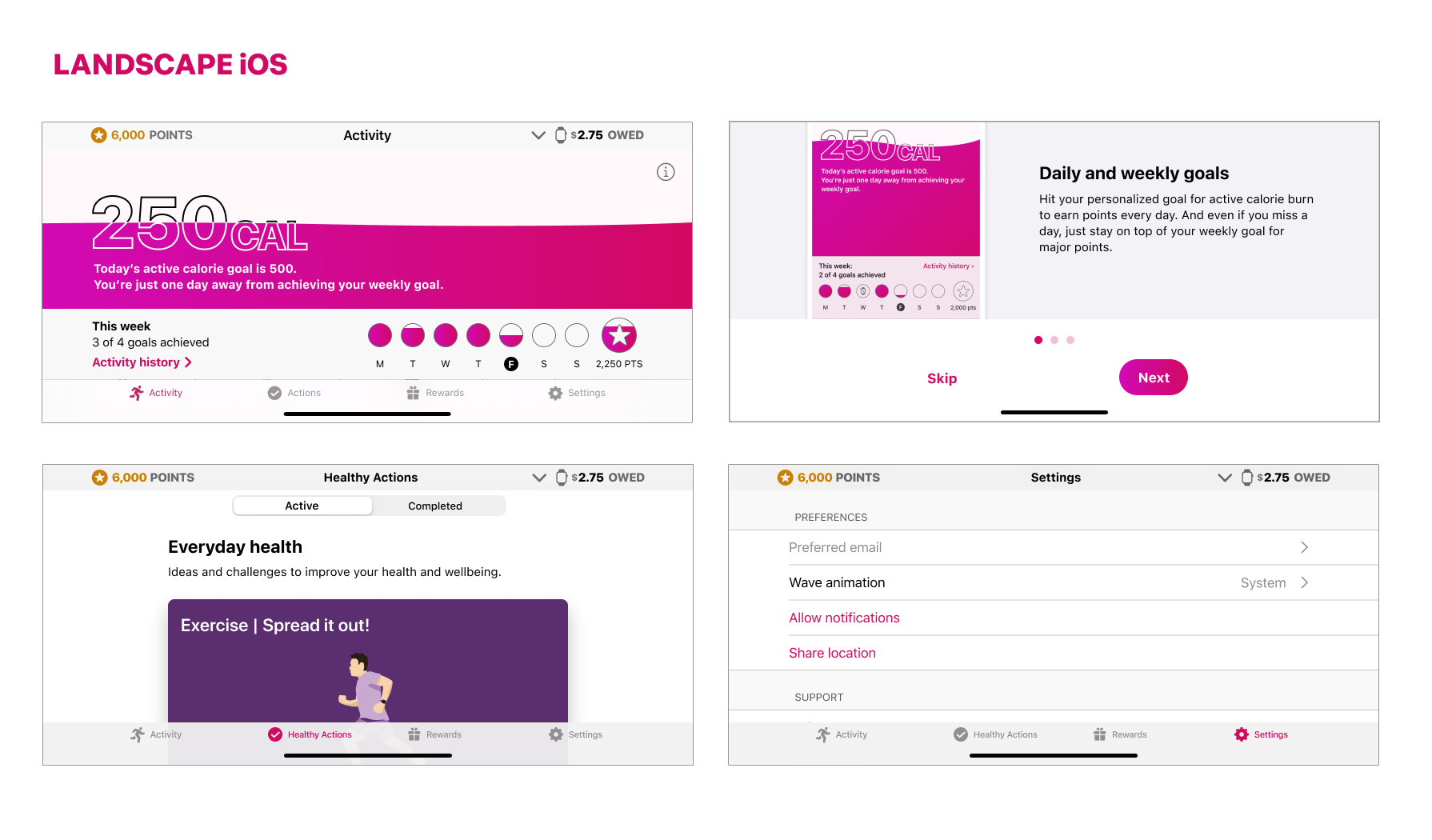
Landscape orientation iOS: For most of Attain’s screens allow overflow UI to be scrollable. Special screens such as the Activity page needed additional techniques to fit within the viewport without scrolling. Text heavy screens need to be allowed to scroll, and line lengths are restricted for readability. Key screen layouts were provided to engineering to guide landscape implementation.
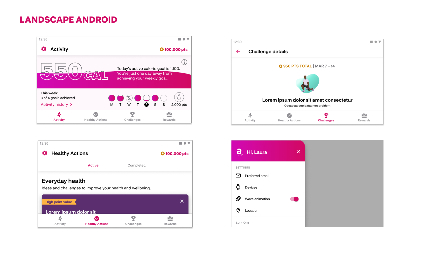
Android apps often allow for landscape mode as a standard in comparison to iOS. Status bar is often visible and navigation bars are the same size no matter the orientation.
Landscape orientation Android: For Attain we implement more instances of side-by-side on pages that need it. Otherwise, scrolling will go a long way. It was beneficial to determine which UI elements lock to the sides of the device so that all screen sizes are supported.
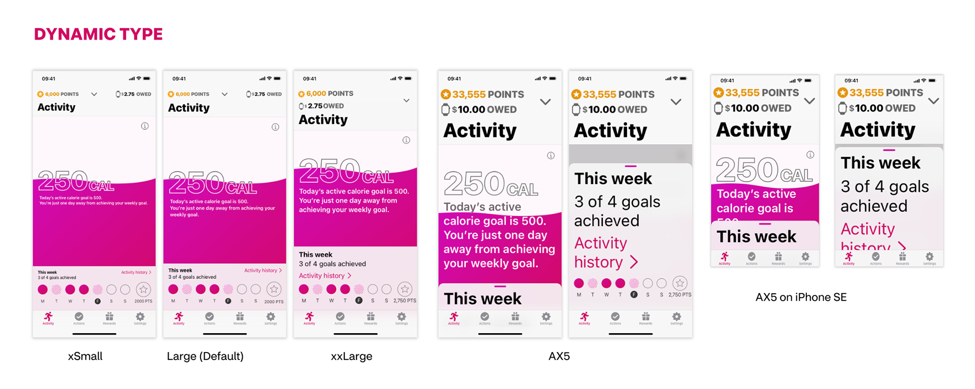
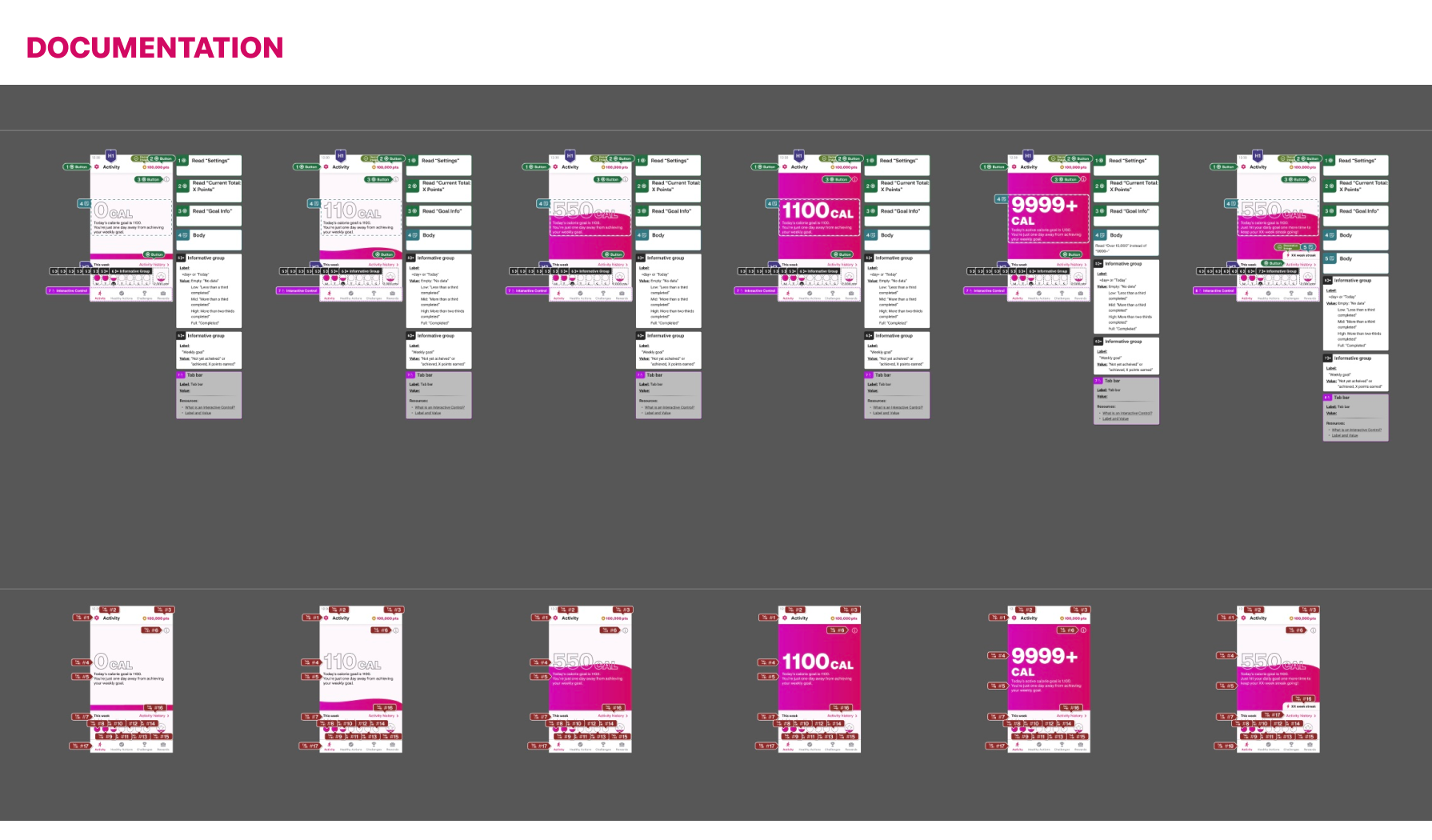
iOS dynamic type: For dynamic type sizing, Apple guidelines suggest the font sizes that are used across the different text sizes. Not all apps accommodate the “larger accessibility type sizes” because they can get very large and are a hidden option in the device settings. Text inside navigation bars typically don’t scale as the user can hold their finger on the tabs (and other interactive elements) for Apple’s “Large Content Viewer”
When designing for these Dynamic type sizes, we didn’t supply all 12 sizes for every screen to our developers, but rather we focused on screens that require special attention and using our guidelines document to cover the basics. For the larger type sizes, there were instances where we created new behaviors in our UI so that users can properly read everything with the intended hierarchy. For example the "this week" section in Activity page is converted to a drawer for larger sizes, giving the context more room while retaining the original intent of the page.
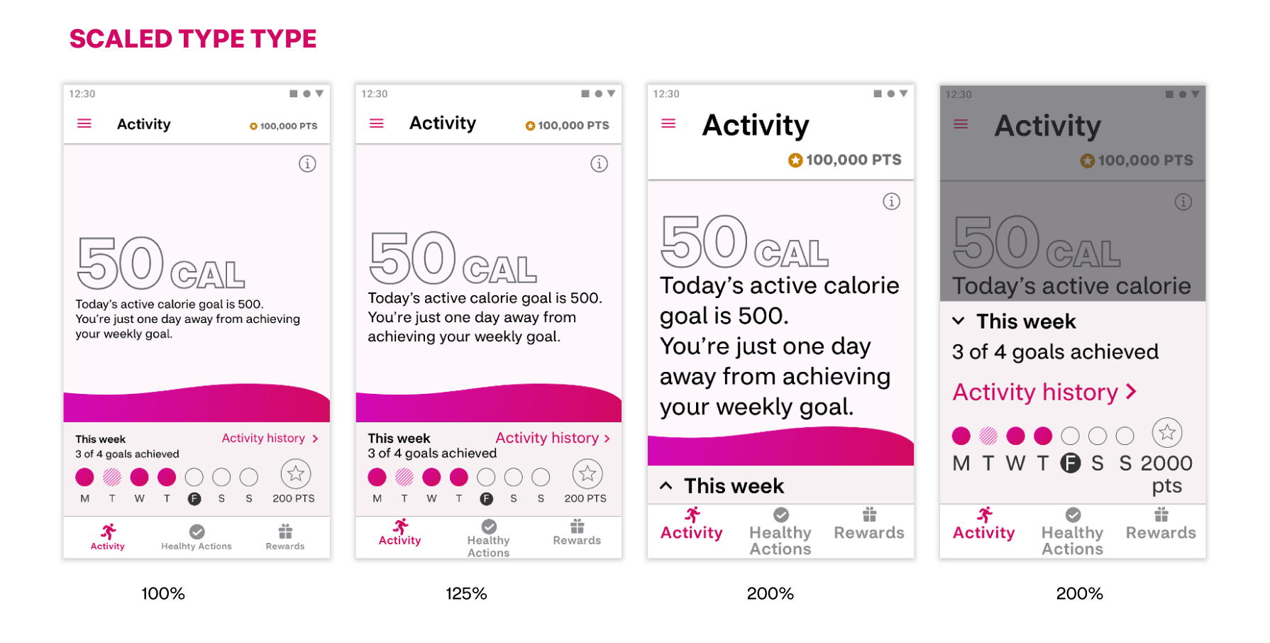
Android scaled type: For Android, scaled text sizes available to users depend on the device and manufacturer. Standard Android includes at least four size options.
For Attain‘s purposes, design provided screens guidance to engineering in the default, 125% and 200%. Designs followed many of the same techniques as iOS, like breaking lines, putting things side by side, only scaling images with text.
Designed features are passed off to engineering with detailed accessibility annotations and focus order. This helps engineering partners to build designs to spec and limits a11y defects in the final app releases.